Showing posts with label arc. Show all posts

زهرة الطاقة في الصين: زهرة معمارية ارتفاعها 140 متر !


زهرة الطاقة في الصين: زهرة معمارية ارتفاعها 140 متر !


هذه الزهرة العملاقة التي تشاهدونها في الصورة هي أحد الروائع المعمارية التي ستَتَفتّح قريباً في الصين تحت اسم “مركز أبحاث جامعة وُهان” أو “مركز زهرة الطاقة”.
يقع هذا المركز في مدينة وُهان الصينية وتم تصميمه ليكون أحد أهم المباني التي تستخدم الطاقة النظيفة في العالم، حيث يكتفي المبنى (كسمة أغلب مباني المستقبل) بكل احتياجاته من الطاقة من خلال استخدام مصادر نظيفة كالشمس والرياح ومياه الأمطار.


يتكون مركز الأبحاث من برج كبير ارتفاعه 140 متر يحيط به عدة أبراج صغيرة مغطاه بالنباتات المزروعة على سطحها، أما عن البرج الكبير فتم تغطية سطحه بعدد كبير من ألواح الطاقة الشمسية لتوفير احتياجات المركز من الطاقة النظيفة، وليتمص “مبنى زهرة الطاقة” أشعة الشمس تماماً كما تفعل الزهور الحقيقية!


أما الجزء العلوي الذي تشاهدونه بارزاً من أعلى المبنى فيحتوي مولدات هوائية تقوم بتوليد طاقة إضافية نظيفة من الرياح.
ولم تتوقف الطاقة النظيفة عند هذا الحد، بل يستخدم المبنى منظومة مائية تقوم بجمع مياه الأمطار لاستخدامها في تبريد الهواء الساخن داخل المبنى، لتقليل الحاجه لاستخدام المكيفات.


أبدع هذا التصميم شركة جرونفميج الهولندية بالتعاون مع مكتب سويتيرز فان المعماري وسيقومان بتنفيذه خلال الفترة القادمة لتزرع الصين بذلك زهرة يانعة في بهو الطاقة النظيفة في العالم.

WATERVILLA


WATERVILLA


UNA VIVIENDA FLOTANTE EN EL RIO AMSTEL

Por Marcelo Gardinetti

El estudio de arquitectos Holandeses 31 Arquitectos diseño esta casa flotante ubicada en De Omval, sobre el rio Amstel en Amsterdam, Países Bajos, que se denomina Watervilla. El diseño tiene un aspecto de vanguardia respecto a la mayoría de las casas flotantes, un tipo de vivienda cada vez más usual en los Países Bajos.

Los propietarios querían una vivienda de planta libre donde disfrutar del aire libre y las vistas del paisaje. El estar y la cocina disfrutan de la vista panorámica de la Amstel con acceso a la terraza flotante. Las formas curvas de la fachada están generadas a partir de la restricción de no superar los tres metros de altura por encima del nivel del agua. Los dormitorios se encuentran un nivel por debajo del estar, separados por un espacio de transición que permite generar una terraza sin exceder la altura de edificación permitida.

Las caras exteriores de la casa están revestidas en aluminio brillante, que acentúa las líneas circulares. Las paredes blancas y los techos de yeso siguen las curvas de la fachada, dando lugar a una transición sin problemas desde el exterior hacia el interior. La superficie total de la vivienda es de 197 m2.


INFORMACIÓN DE LOS ARQUITECTOS

This tautly designed houseboat floats in the Amstel river of Amsterdam.

The design has, unlike most floating houses, a very contemporary design without losing the characteristic appearance of the typical houseboat. The clients get a lot of positive reactions, it evens happens that people who pass by boat knock on the windows and ask if they can enter the boat.

Living on the water gets more and more popular in Holland. The clients/ owners who come to our office always love the typical charms and characteristics of living on the water but don’t like the standard “caravan” appearance of the existing houseboats. More and more people want to live on a contemporary houseboat that has been designed for their specific needs, the houseboat at De Omval is an obvious example of this wish.

The clients wanted a boat with an open floor plan where they could enjoy the views to the water and the outdoor space to a maximum. The distinguished curved line of the facade directly derives from this desire and the restriction that the boat couldn’t be more than three meters above the water.


new project


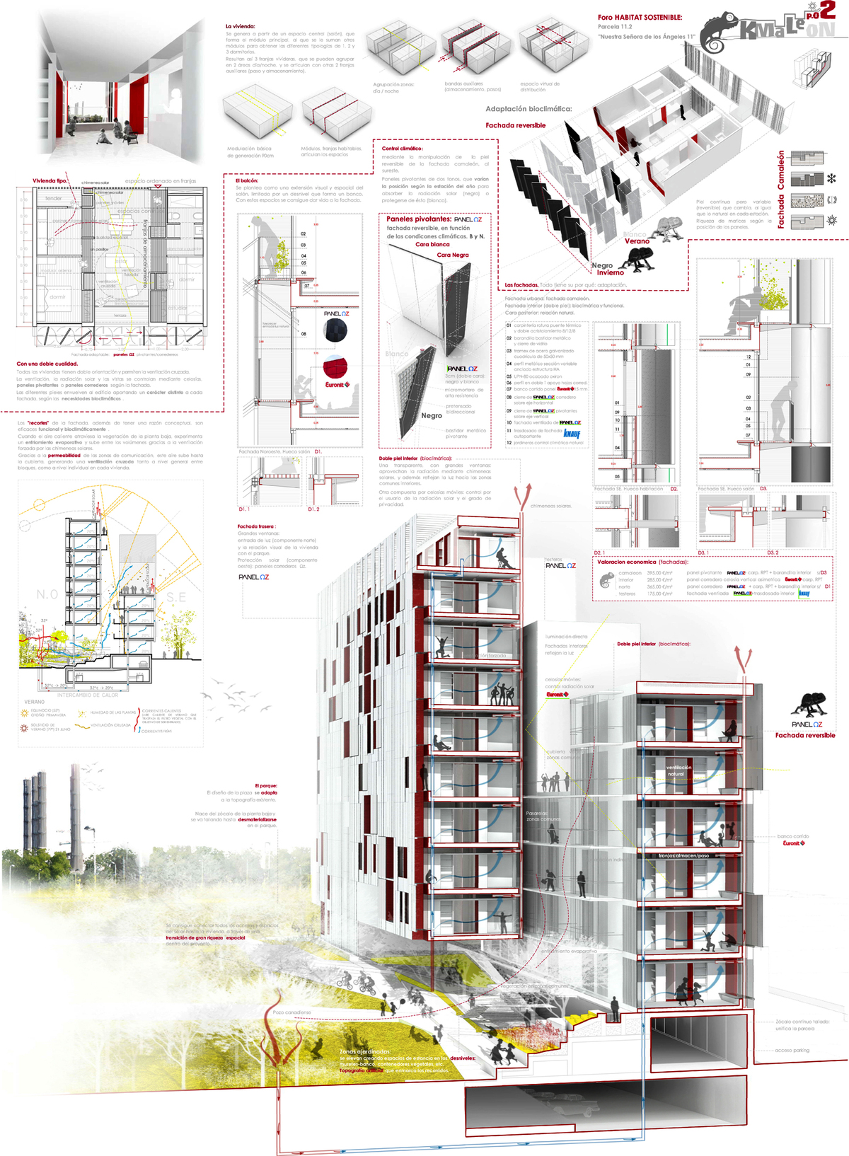
The proposed housing project aims to recover the scale of the main volumes that define the historic widening of “Vallecas”, upgrading the construction and shape to the actual technology and densities.


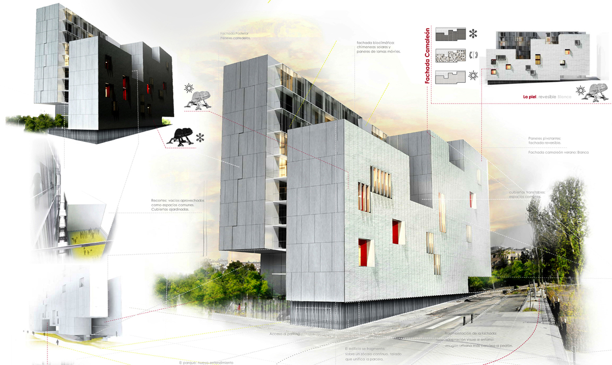
We seek a volumetric arrangement of the building with its surroundings, through cuts in the front volume; we manage to enhance the qualities of the rear volume. Achieving, thanks to this contrast between volumes a double quality (function): aesthetic and functional.

It is essential to give shape to this facade in order to adapt to the urban conditions of the site and thereby serve as a transition between the existing typologies (low-rise buildings, 4-5 floors) and the new one that seek an environmental improvement (high altitude, 8-9 plants).

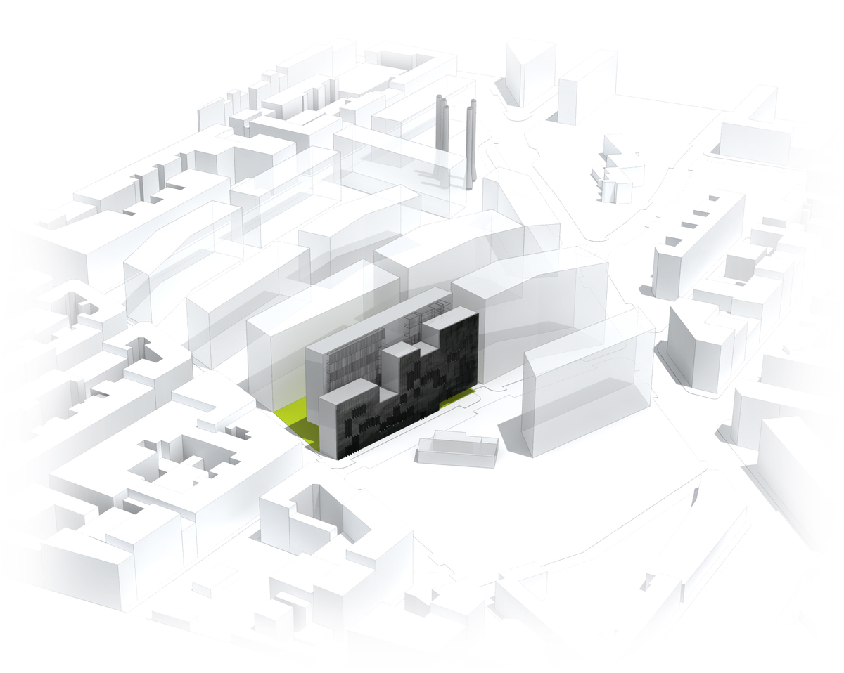
The plot has a marked longitudinality, therefore we seek to fragment this big volume with these cuts, which will be used as common spaces for residents.

Visually he façade is divided into seven rectangles at 5 different altitudes in order to visually adapt the final volume with the surrounding volumes, seeking to recover the domestic urban layout, closer to pedestrians, avoiding massive linear facades that have distorted part of the neighborhood.


In the case of the back volume this dented ending of the volume occurs in its lower part, fitting with the design of the park and urban spaces.
Looking for a new understanding of the common spaces, not as a residual space, but as an essential space of the project, which adapts its self to the functional needs of each area, and whose dimensions emphasize the value of these spaces.


With a double quality

As determining climatic factor all flats have double orientation and allow cross ventilation. This ventilation and views are controlled by a lattice, pivoting panels and sliding panels depending on the façade and its orientation. These different skins surround the building providing a different character to each facade, according to the bioclimatic needs.

The climate control is produced by using a reversible skin (facade “Chameleon”) in the southeast. Formed by two tone pivoting panels (black and white), varying their position in order to absorb solar radiation (black for winter) or protect against this (white for summer).

Therefore, the gain of cold and heat is complemented by the thermal inertia of these materials facade.


The design of the volume

We started from a pure longitudinal volume which we then divided into two with the purpose of optimizing the arrangement of the flats.

The building is fragmented, rising on a continuous base, carved (visually semipermeable), which unifies the plot.

All these decisions of "cutting" the facade, as well as having a conceptual aim, they are functional and bioclimatically effective.

When warm air flows through the vegetation on the ground floor, it undergoes evaporative cooling and rises through the volumes forced by the suction force generated by the solar chimneys.

Thanks to the permeability in the areas of transition, this air rises to the roof generating cross ventilation both between blocks, and in each flat.

Housing units

The housing units occupy the whole width of each volume, stimulating cross ventilation and double orientation.

The housing units are arranged arround a central space (livingroom) following a module to which consecutively other modules are added in order to generate different typologies with 1, 2 and 3 bedrooms.

It is articulated in three main areas, which can be grouped into two areas, day and night.

The balcony

The balcony is thought as a visual and spatial extension of the flats (Living room area), bounded by a small bench. This is designed as a lightweight gateway that provides continuity to the facade.

Public spaces

The public space design pretends to adapt itself to the existing topography. The base emerges and it is carved up into the plot till it finally vanishes in the public space being able to connect all of the site accesses and spaces to the housing units, through a rich spatial transition within the project.

The gardens raise creating elevated resting places with low walls, benches, plant containers, etc.., generating an artificial topography that frames walking paths.

The dual character of the building results in a double material setting.


Urban Facade: Facade chameleon.
Double inner skin: bioclimatic and functional.
Rear facade: relationship with the outside.


Based on the same modulation, the facade cladding varies with the needs of each orientation employing horizontal or vertical blinds, opaque or see-through panels.


Facades
Outer skin


Facade chameleon: continuous texture, variable, reversible...
With a great variety of nuances depending on the position of the panels. Changing in concordance to the bioclimatic needs of each season.
Varies such as nature would do in each season.


Double inner skin (bioclimatic)


One is Transparent, designed from big windows which benefit from the solar radiation (solar chimneys) and reflect light into the interior of the housing units.
The other one is composed from sliding lattices controlled by the users according to their needs of solar radiation and the amount of privacy they are willing.


Back skin

Formed by large windows that allow the entry of light (northern orientation) and a visual connection between the housing units and the park. Solar protection (on the western orientation) is achieved by sliding panels.


Status: Competition Entry


Melbourne City


Hello Melbourne, its an amazing city, a melting pot of various culture and ethnic. Love their public architecture, love their tram network system, love their lanes, there is always something new to discover, every corner is a mystery, a journey that invests me to explore more.

How I wished I studied in Melbourne instead of Perth.


I think this is Bourke Street at Melbourne City, it is the heart of the cities shopping.


Unlike most cities around the world, Melbourne’s tram network system are preserved, cable tram lines were progressively converted to electric trams from the 1920s.


Federation Square, not by Daniel Libeskind. Strategically located opposite the train station, Federation Square is known as the meeting point by the locals. According to my lecturer in Curtin, the architects involved in this project was overjoyed with the success of this project, thus they expected a tsunami of ‘big’ clients, unfortunately, nobody wants them (sort off).


Over budgeted and delayed, I think they got an F for their portfolio. Architecturally, Federation Square is amazing.


One of the many lane ways in Federation Square.


Pity the CAD monkey, pity the builders, pity the cleaners.


I think this is the Melbourne Custom building, an optical illusion. What’s the reason for this sort of architecture? Anyone?


Southern Cross Station, designed by Grimshaw Architects.


A tower in a shopping mall


The Royal Exhibition Building


Shrine of Remembrance, a place to remember Australian soldiers died in World War 1 and 2. They have a handful of Nazi and Japanese Imperial Army’s uniform, an original copy of Adolf Hitler’s Mein Kampf. Jewish hand band worn by Jews in concentration camps and more.


Am not much of a writer, Melbourne city is way way way much better and livelier, you got to be there to explore the city, to experience the atmosphere. It is a live-able city, looking forward to visit Melbourne again.

Sensational Park

The aim of the Sensational Park in Frosinone, Italy was to harmonize the relationship between nature and urbanism. The design based around the 5 senses invites users to define their own path discovering different spaces along the journey. Designed by Nabito Architects & Partners the park was completed in October 2009 and is comprised of a series of truncated cones submerged amongst the landscape.

images courtesy of the architects

Stedelijk Museum

The Stedelijk Museum in Amsterdam will be expanded with a concept that connects the old A.W. Weissman designed building with a new Benthem Crouwel designed one, creating a striking contrast between them. The addition will provide an additional 12000 m²

Blogroll

 
Design by Wordpress Theme | Bloggerized by Free Blogger Templates | coupon codes